The Norwich University of the Arts (NUA) Grad Fest
As soon as we stepped into NUA’s Grad Fest, we knew this wasn’t your typical student showcase. The branding was spot on, with signs cleverly placed to guide us through the building, leading us straight to the main event on the third floor.
As Junior Designer, River, and I wandered through the exhibition space, we were blown away by the incredible display of student projects covering almost every inch of wall space. The quality of the design and creativity on show was absolutely amazing! Personally, one of my favourite parts was the engaging motion graphics that added a dynamic touch to the different brands; really bringing them to life.
With so much on offer I could be here all day talking about all the different projects but instead here are our top 5 picks from the day…
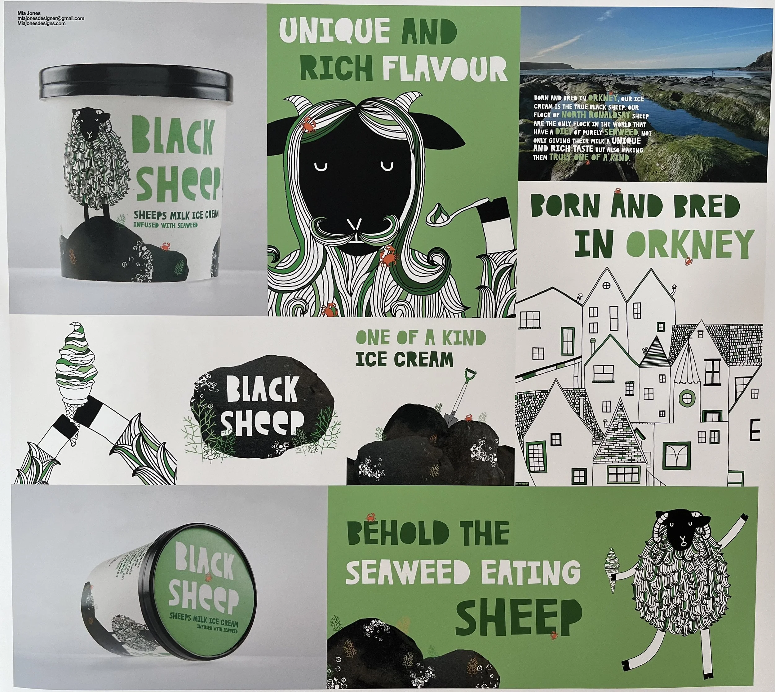
Number 5: Black Sheep by Mia Jones
I’m a sucker for a brand that skillfully combines illustration, typography and photography while also delivering a playful and humorous tone. The use of a simple colour palette adds to the brand's striking design and grabs attention effortlessly. While still managing to stick to its roots by paying homage to the origins and story of the product. Personally, I wouldn't mind trying it out myself!
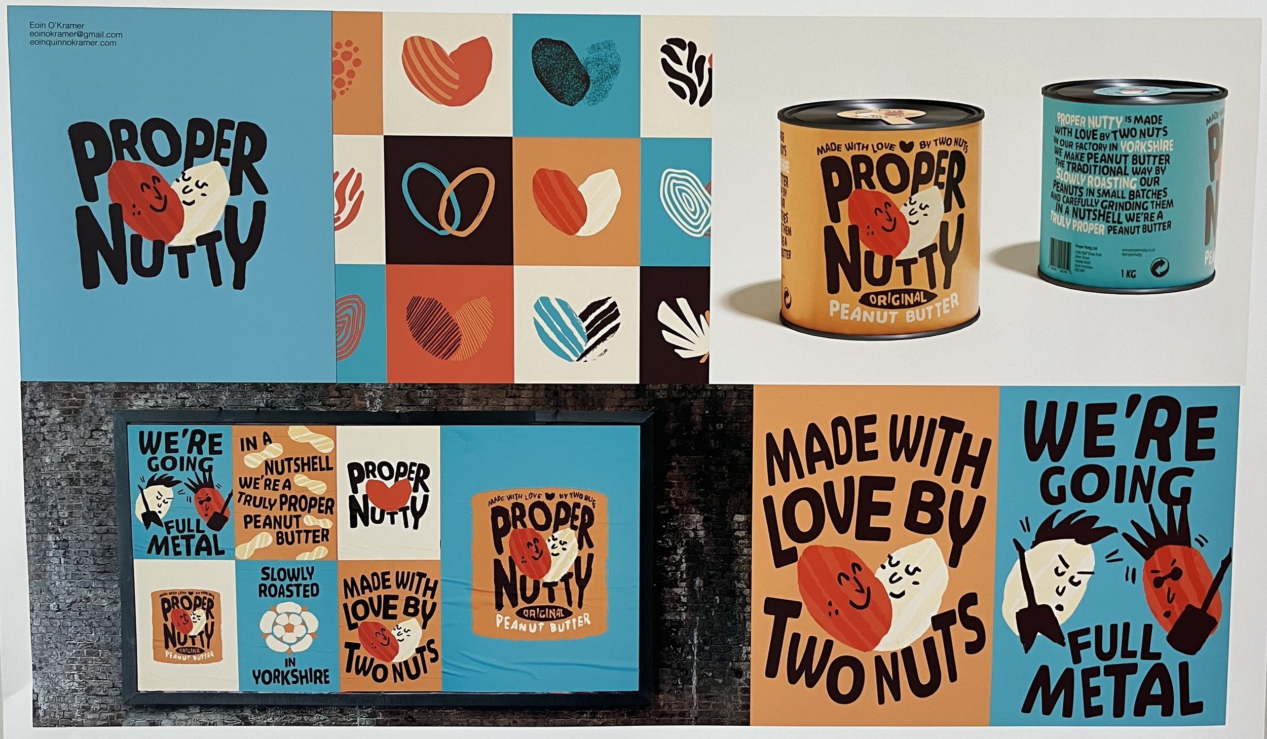
Number 4: Proper Nutty by Eoin O'Kramer
Among the numerous brands developed for the brief, Proper Nutty stood out the most to me. It’s a prime example of the power of great illustration in creating a playful and fun identity—with a colour palette to match. The contemporary graphical layout complements the product design, which pays homage to traditional aesthetics with a modern twist.
I particularly enjoyed the development of various patterns and interpretations of the Nut illustration. All these elements come together to create a library of creative assets that can be utilised across different marketing channels and media, effectively keeping the brand engaging.
Number 3: Verde by Lois Brandon
This brand is an absolutely brilliant example of a brand in motion!
This brand absolutely shouts to a younger audience. The branding is alive with energy just like the spring water drink it represents.
The brand's colourful palette effectively highlights its green credentials, while the clever fusion of urban photography and illustration establishes a strong connection with sports. I particularly enjoyed the imaginative mix of fruit illustrations, such as oranges and melons, with basketballs. Verde is an exciting brand that perfectly captures the essence of its target audience.
Number 2: Crufts by Isabella Atkinson
This Crufts re-branding exemplifies the power of a dynamic brand identity. With a contemporary and minimalist approach, the brand's subtle use of text direction conveys a sense of motion and playfulness. However, it is when the brand is set in motion that it truly comes alive, which can be seen here.
Number 1: Did I Ssstutter? by George Cobbold
My personal favourite, Did I Ssstutter?, captivated me with its clever use of a two-tone design and exceptional copywriting. It's not just about aesthetics; the brand's well-thought-out story is seamlessly integrated into every element, making it a true winner. Effective communication is key, and this design succeeds on all fronts. Did I Ssstutter? manages to be eye-catching, thought-provoking, and educative about the communication disorder it represents. The custom font further emphasises the campaign's core message, creating awareness and fostering understanding. You can view the full brand story here.
NUA's Grad Fest showcased exceptional student projects. We had an absolutely amazing time seeing all the remarkable talent and creativity on show. These brands not only showcased the students' skills but also demonstrated their ability to engage and connect with their target audiences, something that we’re also very passionate about here at Finch Design Company.
Can’t wait to see what next year’s grad-fest brings!


