A Fresh Take on a Traditional Style
DESIGN | Freshground
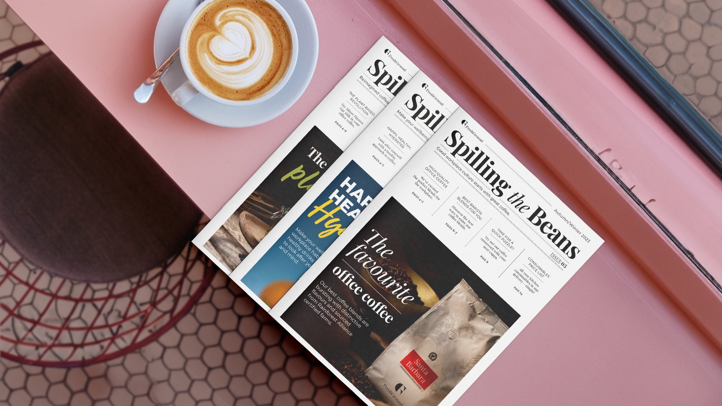
We were excited to be asked to design another issue of FreshGround’s ‘Spilling the Beans’ Newsletter.


Twice a year FreshGround sends out a new price list. But they like to have some fun with it and send out something more exciting than a spreadsheet. That’s where ‘Spilling the Beans’ comes in; Freshground’s newsletter including their take on the latest coffee trends and inspirations.
Traditional Roots, Modern Flourish
Our design approach was rooted in celebrating the brand’s nearly 40-year history. We used a traditional newspaper style, a symbol of rich heritage, and breathed life into it with vibrant imagery and contemporary typography. Resulting in a design style that paid homage to the past while embracing a fresh, modern outlook.
Colour Coding for Clarity
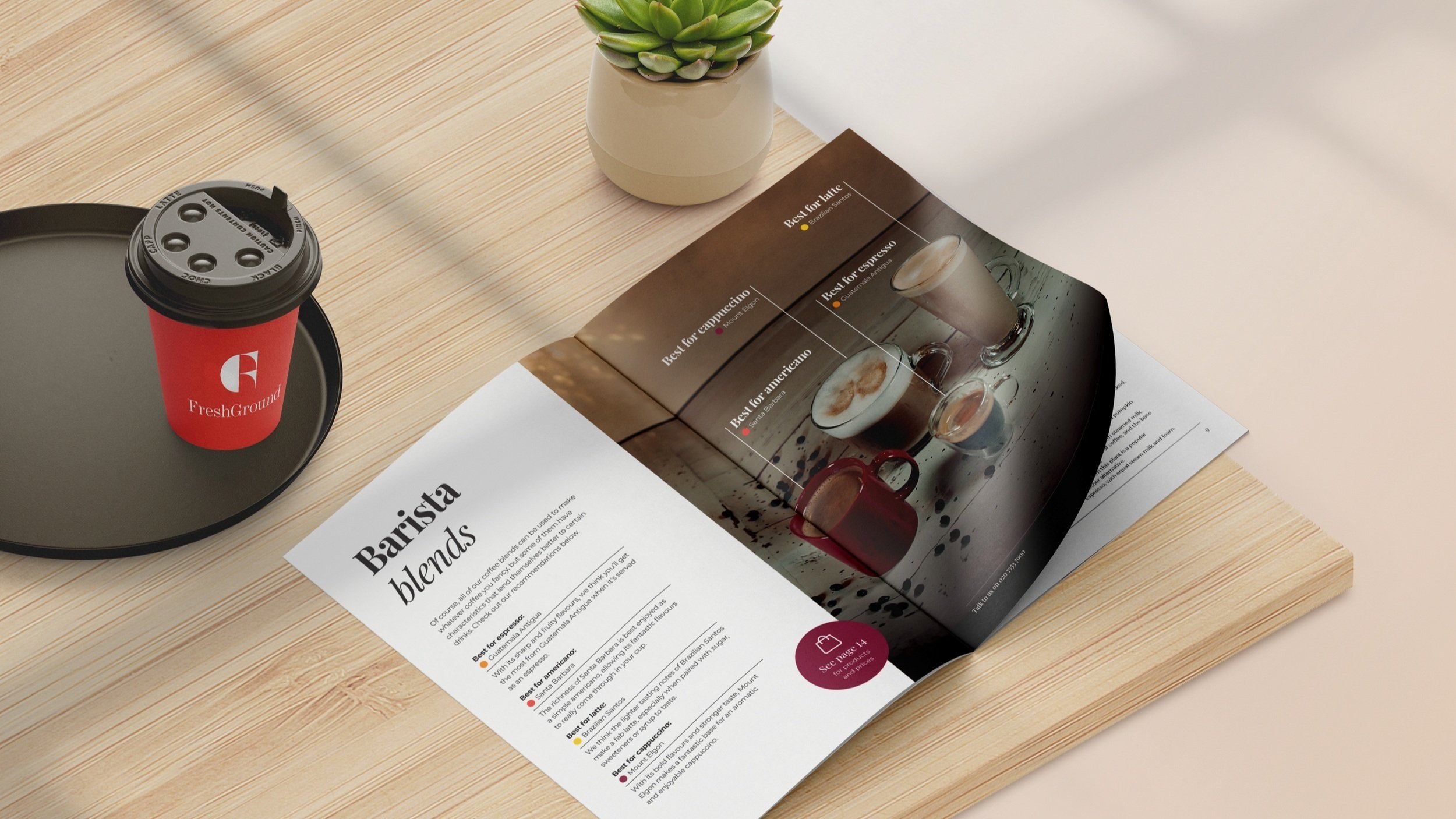
We made use of FreshGround’s distinctive brand colours to categorise different sections of the newsletter, and the information within it, clearly. Besides improving accessibility, this also added a sense of visual cohesion for readers.
A Touch of Tech Infusion
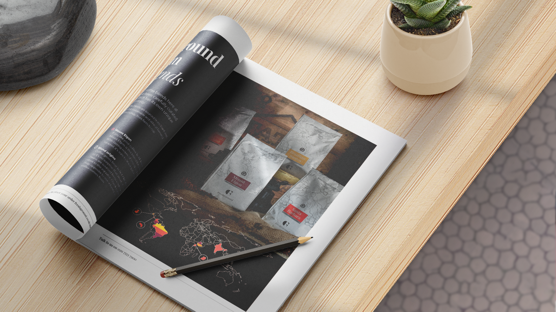
At Finch Design Company, we don't shy away from innovation. We harnessed cutting-edge AI technology to elevate and enhance the imagery in the newsletter. We also paired the striking photography with bold, expressive typefaces. This dynamic duo worked in unison to capture attention and deliver information with impact.
Adaptable Design for an Ever-Evolving Brand
Flexibility was key in our design approach. The ‘Spilling the Beans’ newsletter is not a static cookie-cutter design; it changes and evolves with the brand each issue. Having worked on the design of the previous few issues of the newsletter we know how important it is to have a design that is adaptable and flexible to successfully represent the FreshGround brand.
Luxury Meets Functionality
We succeeded in creating a newsletter that has a touch of luxury while remaining refreshingly clean and straightforward at the same time. Just as it should be, our design prioritises the seamless presentation of information, putting function at the forefront without compromising on aesthetics.