A little touch of luxury
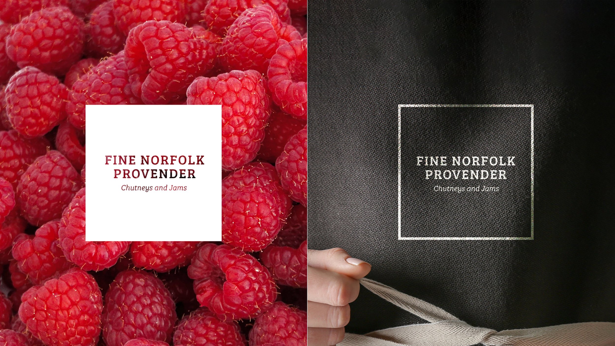
DESIGN | FINE NORFOLK PROVENDERFine Norfolk Provender wanted to reflect their values of modern rustic - after all, this is a family jam & chutney business with each small batch of jars made in the family kitchen.


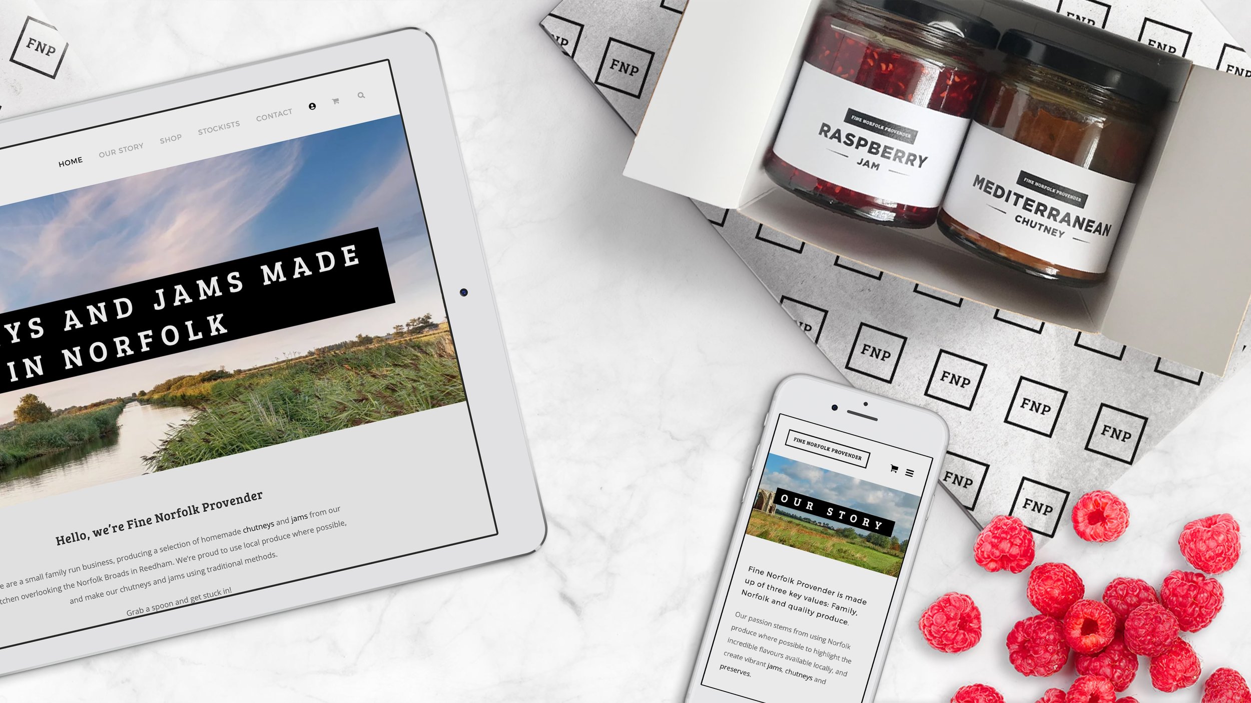
We worked closely to create a variety of directions, presenting mock-ups to visualise the brand on their jars and against the various flavours and colours.
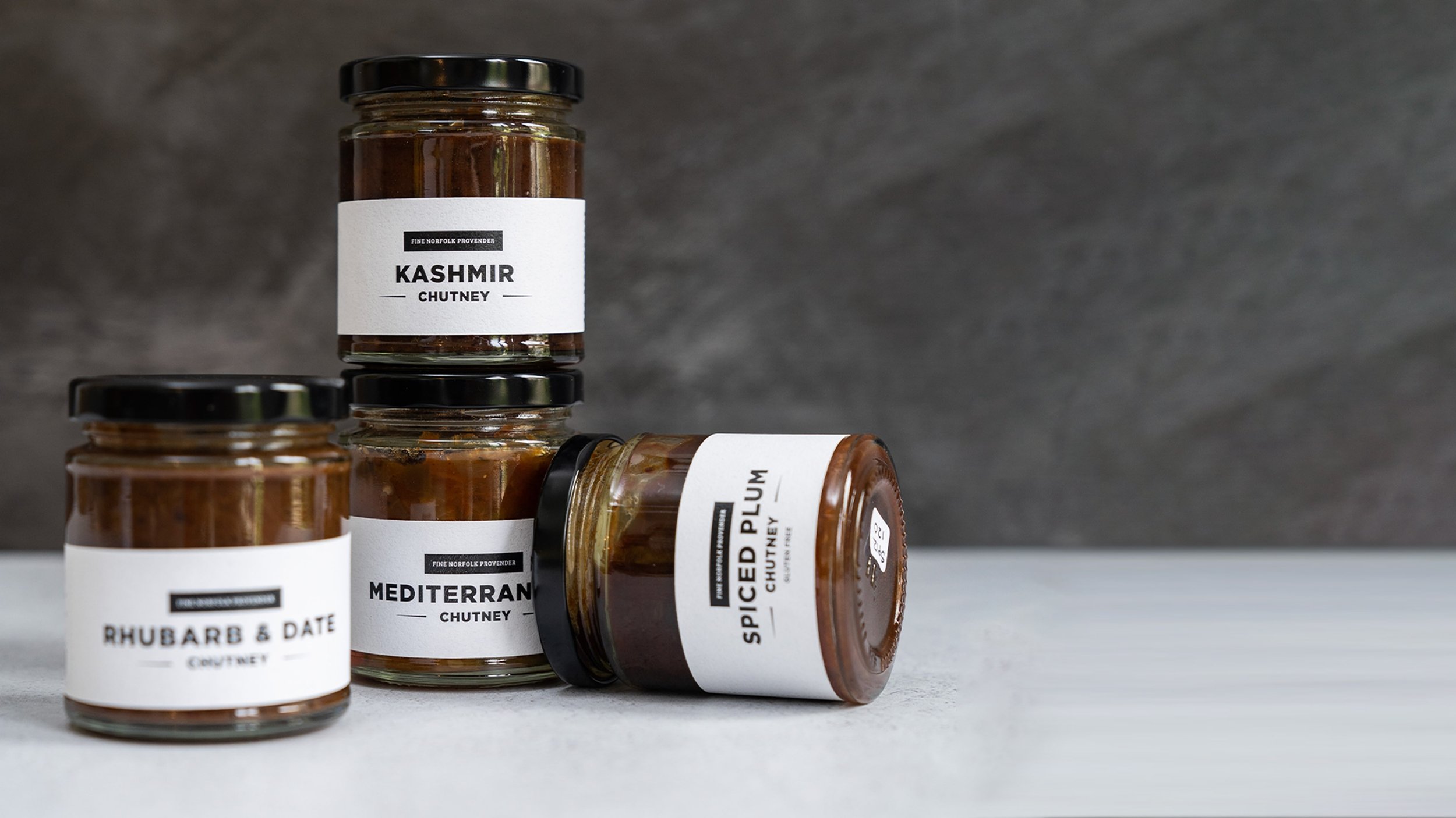
Our key focus was on the labels, the first glimpse a customer would see of the brand. We provided Fine Norfolk Provender with research on the various types of paper available to find the best fit for them. A textured off-white label was chosen, reminiscent of classic wine bottle labels.
On previous labels, customers had struggled to read the small font. To help this, we used a large striking font set on a squat label combining easy-to-read text with the glorious colours of the preserves.
The winning combination of the bold black font highlighted against the textured off-white paper draws the customer’s attention to the vivid natural colours of Fine Norfolk Provender’s chutneys and jams, creating a relaxed but refined tone that allows the customer a little touch of luxury in their every day.