Celebrating Diversity and Inclusivity
DESIGN | QueerFest 2023
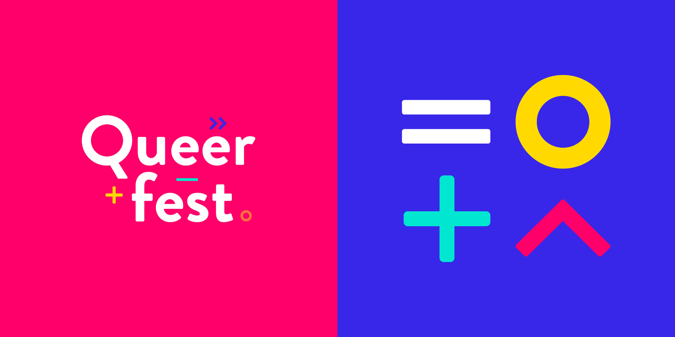
Our logo and branding design for QueerFest 2023 was designed to reflect the unity and expression of the event.


When we set out to design the logo for QueerFest Norwich, our main aim was to create a friendly and versatile logo, suitable for use across all event materials during the exciting February launch of QueerFest 2023.
The QueerFest logo is all about spreading joy and embracing boldness while celebrating the incredible diversity of the LGBTQIA+ community. We selected bright and celebratory colours, avoiding reference to any specific LGBTQIA+ flags, so that it remains inclusive to everyone.
The symbols we incorporated in the logo were inspired by those used to represent gender and sexuality. We wanted to ensure that each symbol was abstracted, so as not to favour any particular group over another, truly reflecting the core values of QueerFest – community, collaboration, and diversity.
But that's not all we did!
We went the extra mile to build the brand's identity by creating simple guidelines. These guidelines not only show the appropriate use of the logo but also suggest layouts and fonts that complement the branding.
Throughout the branding, we used 'Inconstant Regular' – a brand new font designed with dyslexia-friendliness in mind – to reflect the QueerFest commitment to accessibility and readability.
We are proud to say that we didn't just design a logo for QueerFest; we built an inclusive and vibrant representation of the brand’s spirit and values. We hope that the logo and brand guidelines will contribute to making QueerFest a memorable and welcoming experience for everyone involved.