Dancing into a fresh look
DESIGN | HYPE DANCE COMPANYFocussing on Freestyle Disco for young children, Hype needed a fresh and energetic brand poised to expand rapidly in the coming years.


When we were commissioned to deliver Hype Dance Co's branding, we knew that we needed to create a brand that had the flexibility to grow along with the dance company's future success.
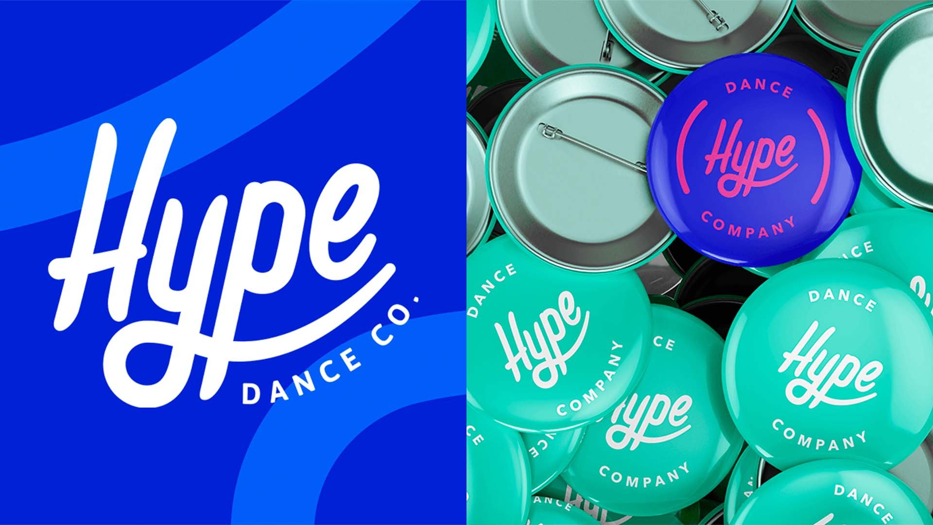
The Hype logo is the essential union of simplicity and style. Using a modern and on-trend typeface in a handwritten style, its tilt and expressive flicks represent the energy and joy of the brand - all the aspects that dancing should be.
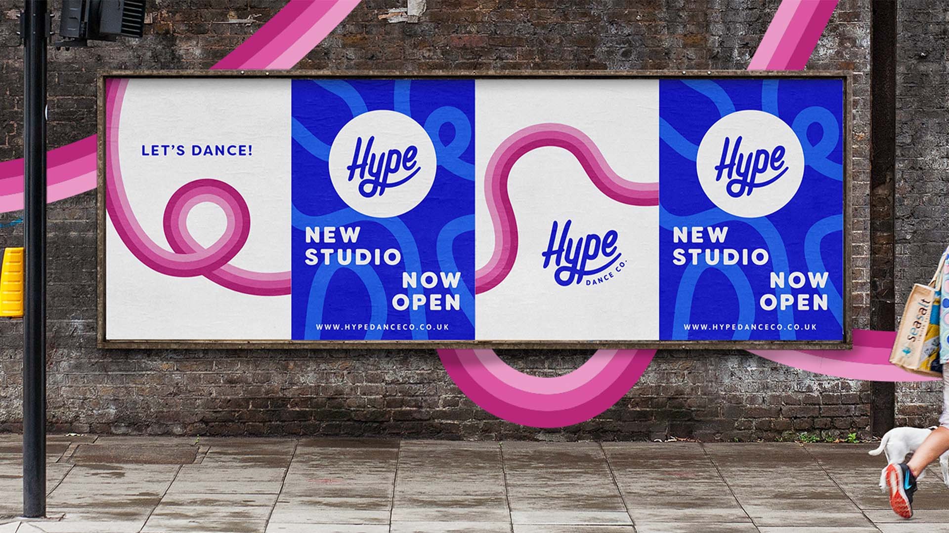
The ‘Y’ is the most expressive element of the logo. Expanding the ‘Y’ creates shapes of movement and flow, giving flexibility to a variety of angles and sizes. The ‘swoosh’ of the "Y" is the ultimate tool of expression with the brand, underlining the whole word. The celebratory feel of Freestyle Disco allowed us to lean into using bold colours reminiscent of Miami beach.
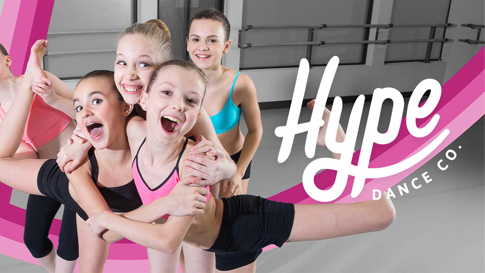
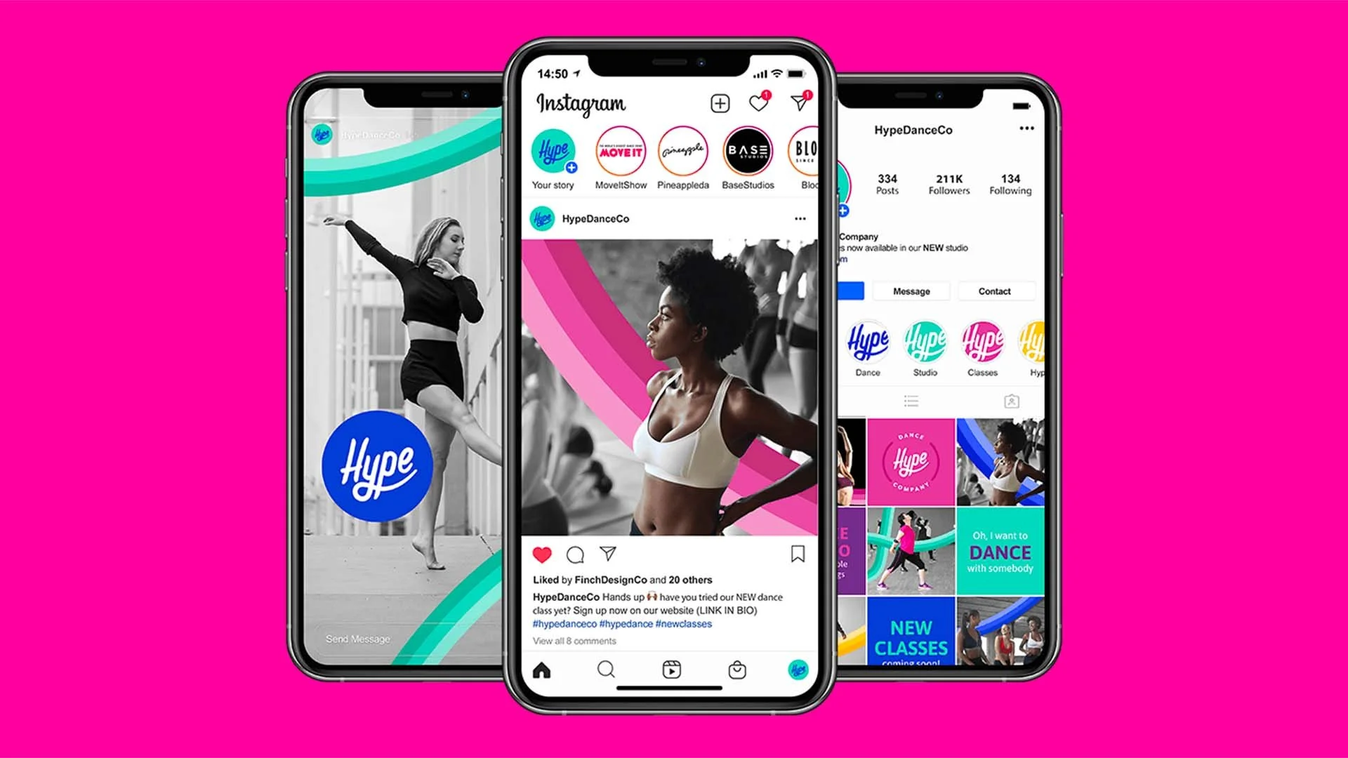
People-centred imagery connects with the movement and joy of dance and the deeply personal nature of the brand. Using the ‘swoosh’ overlaid on imagery connects the brand elements together - a perfect combination to playfully emphasise the Hype’s identity and purpose.