A feeling of calm
DESIGN | VICTORIA ROSE PILATESWhen she started Victoria Rose Pilates, Victoria knew she wanted to bring a little calm to an ever-increasingly fast-paced world through the practice of Pilates, focusing her clients’ minds as well as challenging joints and muscles.


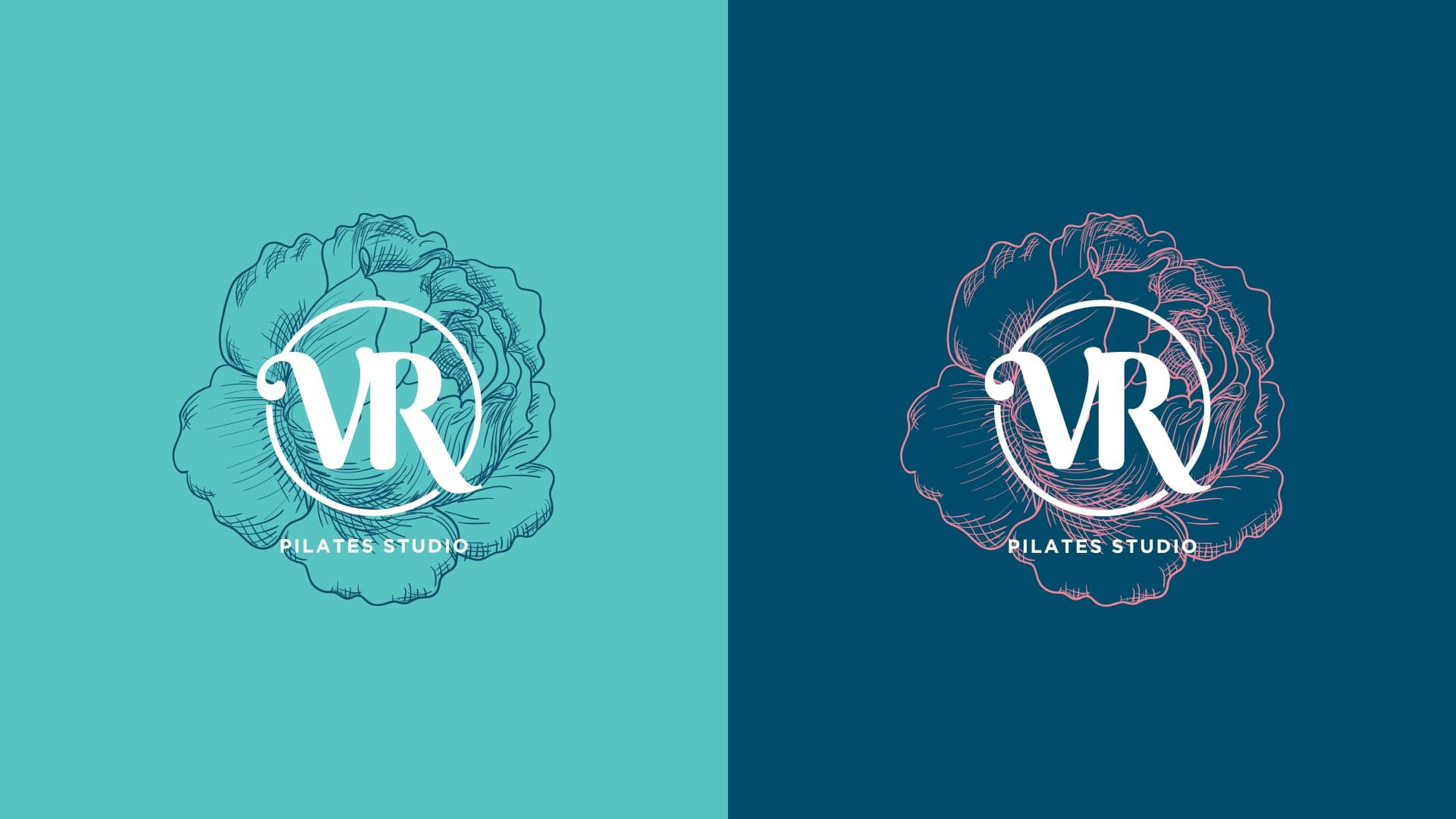
She came to Finch Design Company with one request - to ensure a rose was included in her branding, to create a personal symbol of connection with nature and the essence of Pilates.
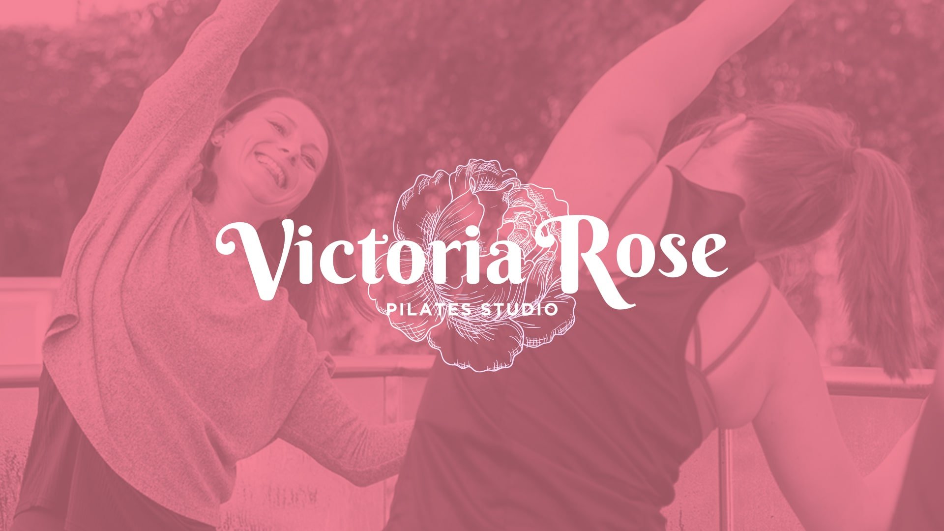
Our first aim, therefore, was to capture this feel in her logo. The delicate rose brings a feeling of nature whilst the fluidity of the font and imagery reflects the calm movements of Pilates. Typography was key here - by using a contrast of script and san-serif fonts we are able to show flow through the script font, while the strong form of the san-serif font demonstrates the strength and elegance of Pilates.
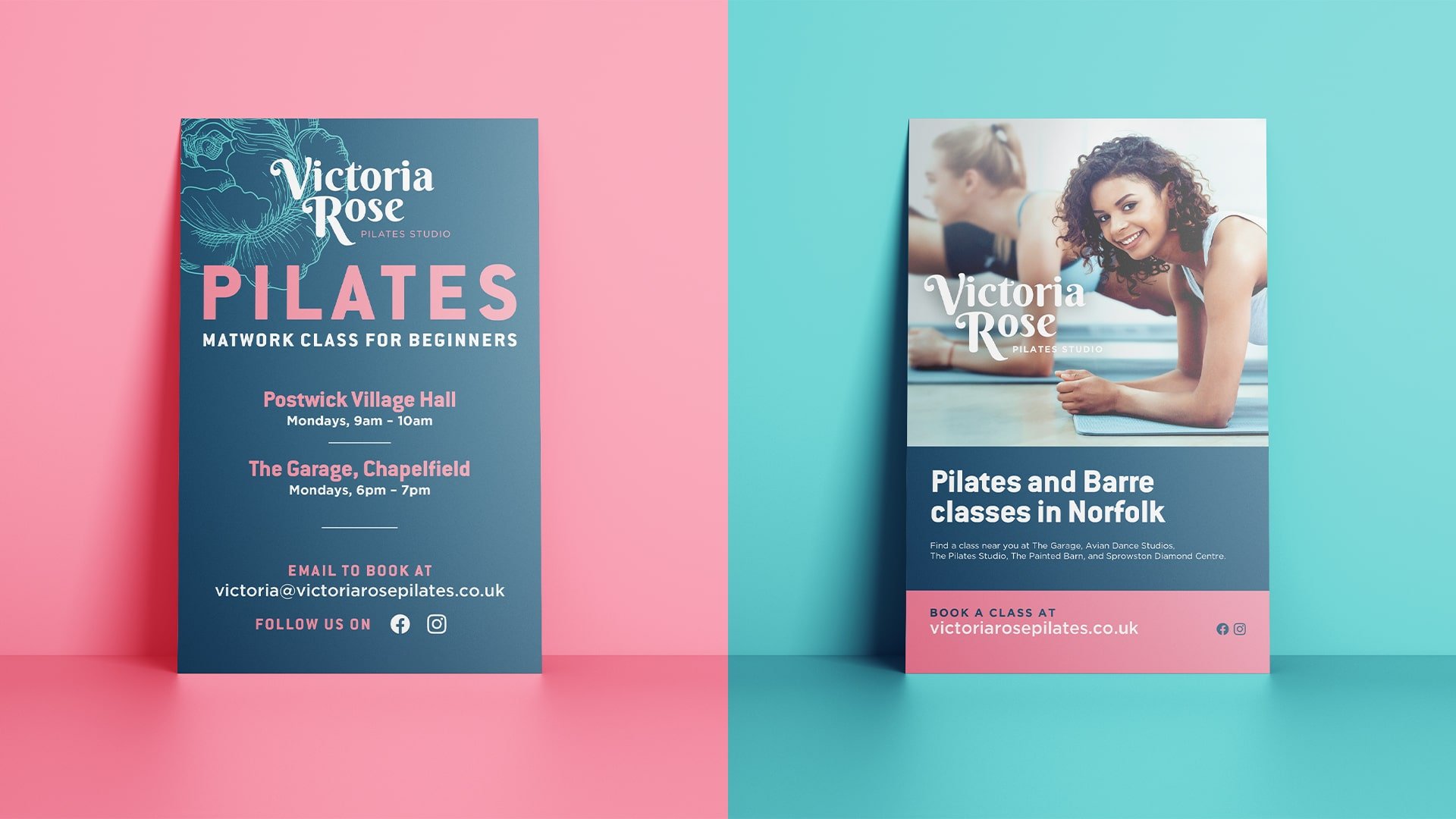
Colour and photography were equally important. Pilates is of benefit to everyone, so we made sure that we used a unisex colour palette that could be used in diverse ways. The colour palette also allows Victoria to promote different classes and compliments photography.
As standard with all branding projects at Finch Design Company, we provided various lockups of the logo, allowing Victoria Rose Pilates to use it in various places in print, digital and social marketing.
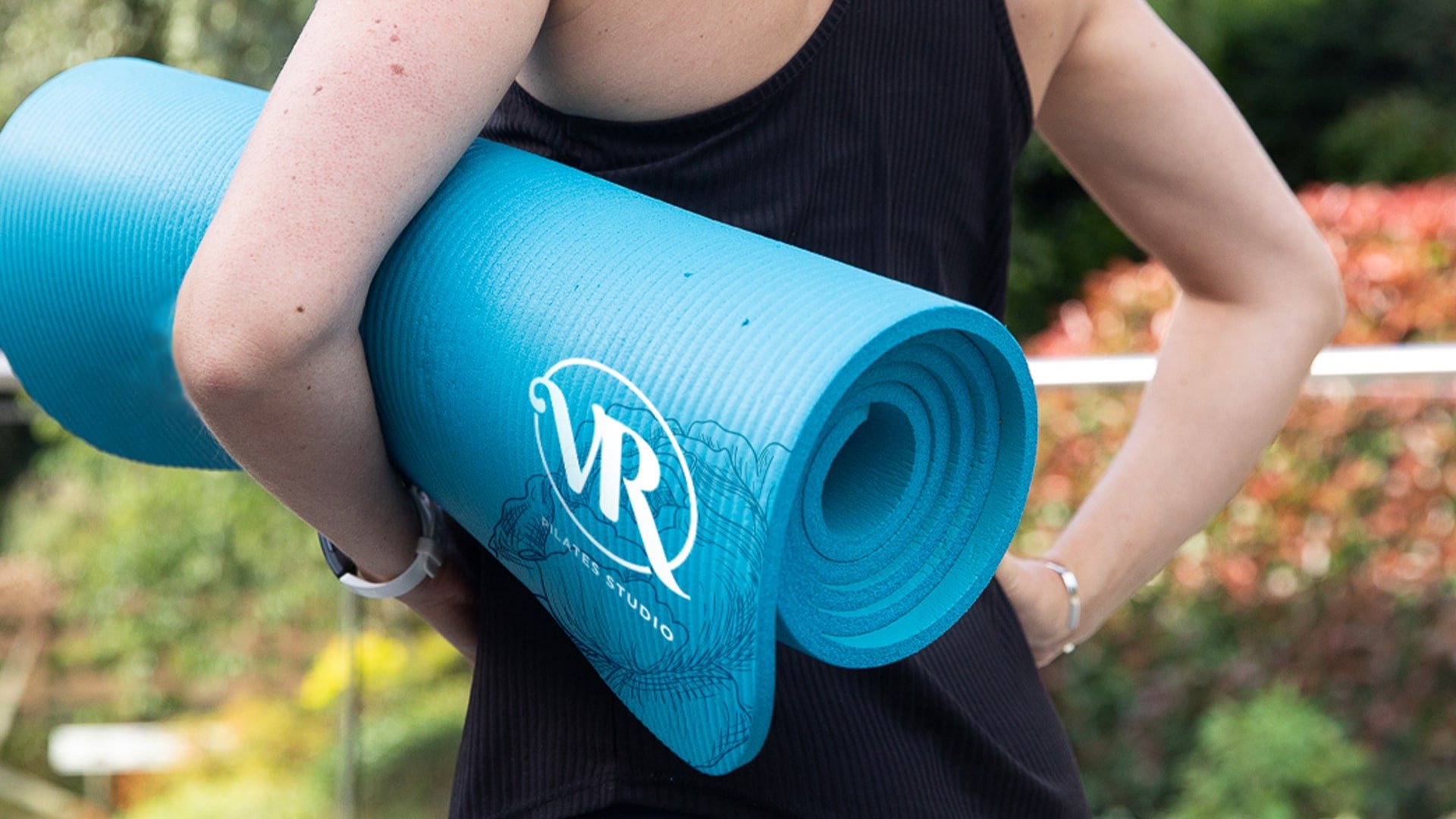
Victoria is looking to open a permanent studio, so we made sure her branding had the flexibility and longevity to last, and look just as incredible in a studio space. Mock-ups were created to demonstrate the look and feel of a potential future studio as well as the creation of merchandise such as bottles, bags, mats and more.